CHOOSING AMISH BARS
I’ve been thinking about my fabric choices for the upcoming Amish Bars quilt camp. It should be easier to pick, since I really only need two fabric choices, but I can’t decide. I thought it would be fun to mock up some options and see what this quilt could look like. These were done rather crudely in Photoshop, but it helps to get a visual. Sometimes with quilts it’s hard to imagine how all those fabrics will look together. I still haven’t quite settled on a combination, but luckily I have a couple more weeks to play around with it and get it just right. I love the graphic simplicity of this design so much.
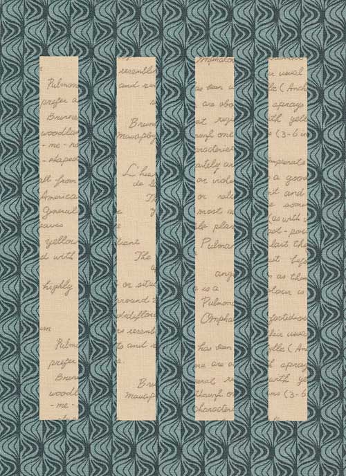
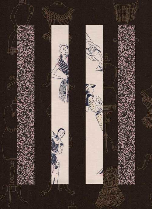
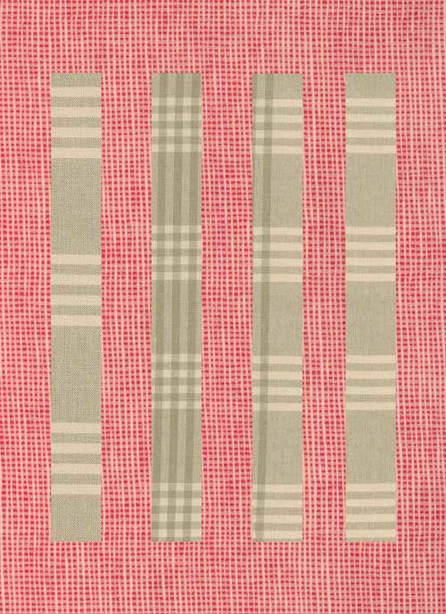
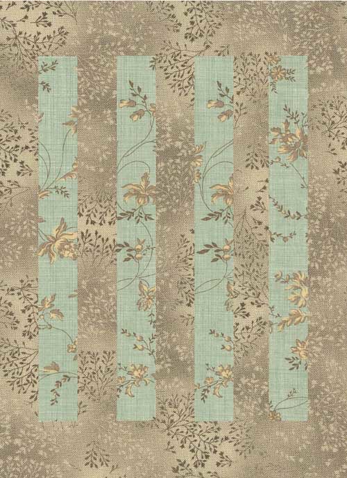
Fabric selections : 1. Karyn (Blue Geo Print with Cream Text) 2. Jerisse (Black Dressmaker’s Form with Mauve Bramble & Vintage Lady Illustrations) 3. Rosalyn (Nectarine Mini Check with French General Plaid) 4. Debbie (Ash Grey Fusions with Aqua French General)
17 comments
Wow! What great choices! I especially love that #2 incorporates a third print so well, and how in #4 the foreground weaves into and out of the background. They all would make for great quilts I’m sure!
I think #4 is the most beautiful choice 🙂
The fourth one is my favourite…..
Of course they’re all fabulous but Rosalyn’s plaid-on-check is my fave. Gorgeous.
ooh, I’m loving 2 and especially 4!
Great! r ist my favorite too!
Love Love Love #2!
i love the 3rd. bold!
I’, loving 3 for the contrast and irregularity of the lines. but you have the midas touch karen and everything you do is stunning… cant go wrong!
3 is my fave-great contrast with the red. Thanks for the help yesterday-didn’t even know you did a shirt dress class-great minds think alike!!
Ohhhh, tough choice: they’re all so pretty! I’d be torn between #1 and #2 for a final choice though; there’s something about that geometric print with the text I just love, but those dress forms, amazing!
I think #4 narrowly over #2. Great ideas!!!
1 and 4
so simple, so pretty….
I have to go with #4 – so pretty 🙂
Jen J
Wow!!!
I absolutely LOVE the first two. I love the contrasting prints & colour choices.