INTRODUCING : ANDREW CLOUTIER

There’s a wizard working behind the scenes of the workroom that you likely have not met, but you’ve surely admired his work. Andrew Cloutier is the designer behind all the beautiful graphics and branding of the workroom. He is also the fellow who makes me laugh on a daily basis, cooks me eggs before I go to work on the weekends and watches Gossip Girl with me every week. This introduction is so long overdue!
A quick glance through his impressive portfolio and long list of awards show that while I’m certainly biased in my admiration of his work, I’m not alone. Everything Andrew designs is like music for your eyes. His attention to detail is incredible, every letter is perfectly kerned, every colour is just the right shade and most importantly he understands his client and delivers exactly what they need. I can certainly attest to this. I give very little input besides a bare bones brief of each project. If you know me even a little bit, you will know that all his designs for the workroom perfectly represent me, my style and the concept.
The success Andrew continues to achieve in his career is the result of incredible talent, dedication and understanding of his craft. Amazingly, he keeps getting better in everything he does. You should taste his nachos! Divine.
What is your first creative memory?
Andrew : Art day-camp. I was a terribly uncoordinated child. I showed no interest in any sports at all so my Mother sent me to an arts and crafts day camp. Think: macaroni sculptures, plasticine, and finger painting. I remember laying on my stomach on the floor of the gym at the local church, drawing an airplane.
What is the story behind the workroom’s elegant design?
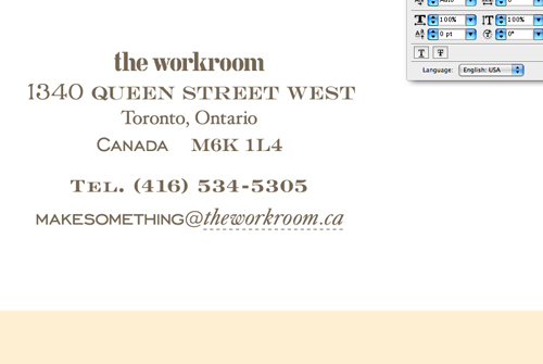
The Wordmark : I’d been wanting to do a stencil-style logo for a while. This often happens… I’ll have an idea in my mind but no client to sell it to. I had to wait for the right client to come along. Sometimes these things take years. I think it’s perfect for the workroom. I’m glad I kept that one in my back pocket. The font I used for your wordmark was designed by my favourite foundry, Lineto, in Switzerland. Gorgeous.
The Typography : I set the type with an eclectic collection of my favourite typefaces. There are so many things happening at 1340 Queen West. One font just would not do. It ended up looking like a vintage letterhead that would have been set by hand, which is perfect for the space and the business.
The Pale Pink Box : The box is a workspace to write in, just as the workroom is a space where people make things. The pale pink represents you. It’s definitely the colour of you. I think all good graphic design work serves as a biography. I wanted the finished identity to be unmistakably Karyn.
You’ve talked about learning to make a quilt. What interests you about quilting in particular?
Andrew : Quilting is graphic design with fabric. It’s mathematical and grid based, which suits my mind. Dots of ink and pixels of light are the standard media in my business. The thought of fabric as a medium is super fresh. Plus, I like to sew. I like the sound of the machine and the little spotlight on the working area. It’s kind of dramatic. I’ll be making a pixel quilt in 2009. Ladies look out. There’s a new Sheriff in town and he quilts.
Most recent project – personal or professional that you are most proud of.
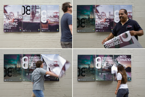
Andrew : I try to be proud of every single project I create. Unfortunately this isn’t always the case. I have some crazy clients who have crazy demands who aren’t always blessed with good taste. To answer the question, I am most proud of the poster pad triptychs I designed for the 2008 Toronto International Film Festival with Joon Park, one of our talented superstars. The pads were hung all over the city last September. People could peel off a poster to take home, revealing a new one underneath, changing the overall image created by the 3 pads. Awesome client, amazing opportunity, and (I think) a cool idea.
What two random things do most people not know about you?
Andrew : Well I think most people don’t know me, so this question really becomes three interesting facts about me. Ugh I really don’t think I’m all that interesting but here goes.
1. I shave my legs. It’s a bike thing.
2. I was once a Sous Chef but chose graphic design instead.
If you weren’t a graphic designer/design director, what would you be?
Andrew : A chef. I love the sounds and smells of a bustling restaurant and the chaos of a busy kitchen. The pressure and the energy are exciting. Feeding people brings a special kind of satisfaction. I was very good at it. I often dream that I’m still working at the restaurant. I miss it very much. I used to work with a Scottish guy named Iain Duncan, CCC (Certified Chef de Cuisine). After work we used to get quite drunk in our chef’s uniforms and pick fights at the bar, sometimes with each other. He was my boss and one of my favourite people, ever. I remember when I was trying to decide whether to stay in design or go to chef’s school. He told me I could be a great chef, until one day I brought my design portfolio to work to show him. He said “F#ck cooking kid. This sh!t is good.” So here I am.

7 comments
Oh wow, amazing. I’ve always admired your Andrew. I need an Andrew. An Andrew to drill holes in super heavy MDF to make a twinkle blackboard. An Andrew to design some cards for me, and make me eggs and watch crappy tv with me (sorry, I’ve never actually seen GG).
<3<3<3
oh karyn, i love that you featured Andrew. Maybe it’s time i do the same thing with Dave. He is my Andrew for sure. I wonder if Andrew enjoyed the film Helvetica as much as Dave did! Awesome, brilliant, wonderful, just like you!
I’ve always admired the workroom’s lovely identity and stationery! The light peachy pink seems the perfect colour and the type treatment is so whimsical and pretty.
I discovered Andrew’s website a while ago and noticed that he also designed those Masterfile promo books. We have them in our studio, and I absolutely love them! The production is impeccable — such fantastic choices of colour, paper, inks, and even the stock images look great!
I just read about The Workroom and your blog in Stitch magazine. Congratulations! I’ve been following your blog for awhile now and trying to figure out a good time to travel down to your store. Seeing The Workroom mentioned in yet another place is like that pesky voice that says, “just go already!” Maybe we will see you soon…
you people are amazing! heart.
i truly admire both of your successes. everytime i look at an aritzia bag, i’m like hey! i know (not really) but i know the dude who did that!
i remember taking a design class involving typography and never understood it. i really appreciate ppl who have the eye for it all. i didn’t do so well, i think i love tracking way too much.
Oh yay! I have often wondered about your man of mystery while admiring his work.
I love seeing couples who work so well together! I had no idea that he was behind all the image branding of the workroom! But I was so delighted to learn that when I read this interview!
I admire you two so much.